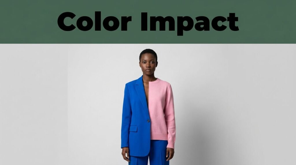
Color is usually one of the first things people notice about what you’re wearing. Even before you say a word, a bright coat, a navy blazer, or a soft pink sweater can leave a quick impression.
These first impressions don’t reveal your personality. The meaning of a color changes depending on its shade, the fabric, how it fits, the setting, culture, and how you present yourself. Still, knowing common color associations can help you wear more color with confidence.
How Clothing Color Shapes First Impressions
Clothing color psychology looks at the meanings people often connect to different colors. It’s not an exact science that can tell your character from your clothes. Still, people quickly judge others based on things like color, grooming, posture, and how formal the outfit is.
Bright, saturated colors usually stand out more than muted or faded ones. For example, cobalt blue feels different from faded denim, and a scarlet dress makes a bigger impression than a brick-red skirt. How much color you wear also matters. A red bag adds a pop of energy, while an all-red outfit becomes the main focus.
Fabric also changes how a color looks. Emerald silk can seem formal and polished, while the same green in a worn cotton T-shirt feels casual and outdoorsy. Tailoring, contrast, and fit all affect how others see the color before they know anything about you.
Color can shape a first impression, but it doesn’t reveal your values, mood, or character.
Why shade, setting, and culture change the message
A pale blue shirt often feels calm and traditional in an office. Deep navy can seem more authoritative, especially in structured clothes. In the same way, bright red might feel festive at a party but too bold in a formal meeting.
Culture also affects what colors mean. In the United States, white is often linked to weddings, but in some Asian cultures, it is connected to mourning. Age, community, religion, and personal memories all play a part in how someone sees a color.
Context is more important than general rules. A lime-green jacket fits in at a weekend event, but the same jacket might seem out of place at a formal dinner. What you wear sends a message based on the setting.
The difference between one bright piece and a full-color outfit
Wearing one colorful piece makes it the focus of your outfit. A red blouse with dark jeans, a yellow bag with a cream dress, or emerald shoes with black pants can look stylish without being too much.
Wearing color from head to toe makes a bigger statement. It can look artistic, festive, trendy, or formal, depending on the color and style. Color blocking adds contrast, so people may notice your outfit before the details.
Starting with neutral clothes and adding one bright accent is often easiest. Black, denim, navy, gray, cream, and brown let a colorful piece stand out. You can control how bold your look is by balancing these colors.
What Red, Green, Yellow, Blue, and Other Colors Can Communicate
No color has just one meaning. Still, these are some common associations in American fashion and daily life.
Red can suggest energy, confidence, and boldness
Red stands out and is often linked to warmth, action, passion, confidence, and power. Someone might see a bright red blazer or dress as bold and expressive because the color draws attention.
The shade of red changes its effect. Cherry red feels lively and direct. Burgundy, oxblood, and brick red look more subtle, while rose and dusty red feel softer. A red lipstick or small bag adds color without making your whole outfit a statement.
Red can feel too bold in a conservative office or at a serious event. In those cases, a deeper red accessory or a patterned piece might feel better than wearing a lot of bright red. Pairing red with navy, camel, cream, or denim can also make it easier to wear.
Green can suggest balance, growth, and connection to nature
Green often feels fresh, grounded, or creative. Because it’s connected to plants and nature, it can seem calming and friendly. Green is also a good choice if you want color but prefer softer looks.
Sage, olive, and moss green usually look calm and practical. Forest green can seem polished and strong, especially in sweaters or tailored pants. Emerald looks richer and more formal, while lime green feels playful and young.
A green cardigan, casual pants, bag, or scarf is an easy way to add color slowly. Cream, tan, brown, denim, and black all go well with green. If you’re unsure about wearing color, olive or sage is a good place to start.
Yellow and orange can suggest warmth, optimism, and approachability
Yellow often suggests cheerfulness, openness, and creativity. It reflects light and stands out, especially in bright shades. A yellow sweater or skirt can make a simple outfit feel happier.
Pale butter yellow looks soft and relaxed. Mustard and marigold feel more earthy, while bright lemon yellow is bolder. Denim, navy, white, and warm brown help balance yellow and make it easy to wear.
Orange usually feels friendly, energetic, and adventurous. Peach and terracotta are softer options for daily wear. Bright orange is sporty and bold, so trying it in a bag, shoe, or scarf is a good way to start.
Yellow and orange can feel too strong if you wear a lot of them at once. A neutral jacket, simple jeans, or cream pants lets these colors stand out without clashing with the rest of your outfit.
Blue and purple can suggest trust, calm, creativity, and individuality
Blue is popular in American wardrobes because it looks calm, dependable, and professional. Light blue feels open and relaxed. Navy is more formal and reserved, so it’s common in suits, uniforms, and business clothes.
Cobalt and royal blue are more energetic than navy. Teal has a hint of green, making it feel both polished and creative. Blue goes well with white, gray, tan, denim, and many browns.
Purple stands out as a unique color. It can suggest imagination, luxury, mystery, or self-expression. Lavender feels light and modern, while plum and eggplant look sophisticated in dresses, blazers, and evening wear.
For work, a navy dress with a lavender blouse or scarf adds color but still looks put-together. For casual days, a purple sweater with jeans or brown boots feels friendly and personal.
White, black, pink, brown, and gray complete the color message
White usually looks clean, simple, open, or polished. A crisp white shirt can seem professional, while a white linen dress feels relaxed and summery. But wrinkles or see-through fabric can quickly change that impression.
Black can look elegant, powerful, private, or formal. It also creates strong contrast, making colorful accessories stand out more. Texture is important too, since black leather, denim, and satin each feel different.
Pink can seem warm, playful, caring, or modern. Blush pink is soft, while fuchsia and hot pink are bolder. Brown often feels steady, natural, and friendly, especially in suede, wool, cotton, or leather.
Gray can seem calm, practical, or sophisticated. Charcoal is more formal than heather gray. Adding jewelry, sharp tailoring, colorful shoes, or textured fabrics can keep neutral outfits from looking dull or too serious.
How to Choose Colors That Match the Impression You Want to Give
Pick colors based on your purpose, comfort, and where you’ll be. Trends can inspire you, but you don’t have to follow them. The best color is one you feel good wearing.
Begin with one color you like. Try it in something familiar, like a blouse, cardigan, pants, bag, or shoes. See if you feel comfortable and if the color matches your other clothes.
Match the color to the occasion, not just the trend
The same color can communicate dThe same color can mean different things in different situations. Navy, deep green, burgundy, and charcoal work well for interviews, presentations, and formal dinners because they feel calm and put-together. A bright accent adds personality without being too much.ations may welcome cobalt, marigold, coral, emerald, or purple. Meanwhile, soft blue, sage, peach, and pale yellow often create a relaxed impression for casual gatherings and daytime plans.
Workplace dress codes can be very different. Notice how people dress, then use color in a way that fits your company and your job.
Use contrast, color pairings, and accessories to control the effect
How you pair colors can make your outfit feel calm or lively. Red with navy is classic. Yellow with denim looks casual and warm. Green with cream feels fresh, and blue with white gives a crisp look.
Complementary colors are opposite each other on the color wheel and create a bold look. Analogous colors, like blue and teal, are next to each other and look more harmonious. Neutrals can tone down both styles.
Accessories are an easy way to try new colors. A colorful belt, earrings, shoes, bag, or scarf can help you find shades you like before buying a bright coat or dress. personal comfort guide the final choice
Color is important, but so are fit and body language. Wearing clothes that fit well, standing tall, smiling naturally, and being well-groomed all help make a good first impression.
Skin undertones can help some people pick colors, but they’re not strict rules. Try colors in natural light, take photos, and see which ones make you feel good. The best color is the one you’ll actually wear.
Color Is an Invitation, Not a Personality Test
Red, green, yellow, blue, white, and all other colors can shape someone’s first impression of you. But these impressions are only part of the story, since shade, style, setting, and your own behavior all affect the message.
Begin with one bright piece of clothing or an accessory, then adjust how bold the color is for the occasion. Expressing yourself is more important than following strict color rules. Adding color to your wardrobe can be a gradual, practical, and fun process.
This post may contain affiliate links. If you make a purchase through these links, I may earn a small commission at no extra cost to you.