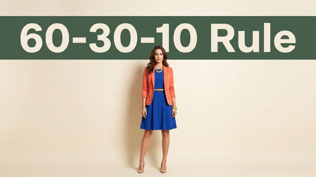
An outfit can feel busy even when every piece is beautiful. The issue is often proportion, not the number of bright clothes you own.
The 60-30-10 color rule outfits formula gives colorful dressing a clear starting point. This 3 color principle lets one shade lead, another support it, and a small accent add energy without taking over.
You don’t need a new wardrobe or a fearless personality. Color psychology can suggest a mood, but personal preference should guide your fashion styling. Start with clothes you already enjoy, then give each color a clear job.
This post may contain affiliate links. If you make a purchase through these links, I may earn a small commission at no extra cost to you.
Key Takeaways
- The 60-30-10 color rule uses one dominant color, one supporting color, and a small accent to create visual balance.
- The percentages describe visual impact rather than exact garment measurements, so consider the size of each color block across clothing, shoes, layers, and accessories.
- Use the color wheel, including analogous and complementary combinations, to choose harmonious shades with less guesswork.
- Adjust the proportions for your natural contrast, and use prints, metals, and the sandwich method to make color coordination feel intentional.
- Build a colorful capsule wardrobe with dependable foundation colors and easy-to-change accent pieces, while letting personal taste guide the final look.
How the 3 color principle creates balance in 60-30-10 color rule outfits
The 3 color principle began as an interior design guideline, yet it works beautifully for attire. It creates a clear visual hierarchy, giving the eye a place to settle before noticing playful details.
The numbers describe visual impact, not exact garment measurements. Judge outfit proportions in the mirror, including layers, shoes, and accessories.
| Share of the outfit | Color role | Pieces that often fit |
|---|---|---|
| 60% | Dominant color | Trousers, dress, skirt, coat, or matching set |
| 30% | Secondary color | Blazer, blouse, cardigan, knit, or overshirt |
| 10% | Accent color | Shoes, bag, belt, jewelry, scarf, or lipstick |
Your dominant color creates the base. For example, a red midi dress may fill most of the outfit at once. In this look, red is the dominant color. With separates, wide-leg trousers and a blazer in the same shade can create the same effect.
The secondary color needs enough presence to look intentional. A cream blouse under a green suit, or a cobalt cardigan over a pink dress, often lands near the 30 percent mark.
Accent color is where the outfit gets its spark. A yellow bag, red ballet flat, glossy orange nail, or turquoise earring can do the work without competing for attention.
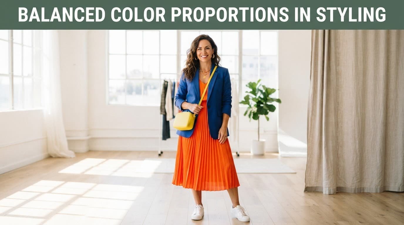
A long coat counts more than a narrow belt. Likewise, white sneakers may appear small beside a colorful dress, even though they are a pair. Restrained color blocks can create a quiet luxury effect without making the look dull, so judge the overall impression rather than counting garments.
Build 60-30-10 color rule outfits with color blocks
Start with the item you most want to wear and use the 3 color principle to guide the rest. If it is a pair of bright blue trousers, make blue your dominant color with a denim jacket, blue knit, or similarly toned outer layer.
Next, choose a secondary color that supports the first one. A raspberry dress with a navy cardigan creates one of the most approachable color combinations for daytime. Add a small citron crossbody bag or yellow earrings as the accent color.
For office wear, neutral colors such as camel, off-white, and black create a polished base. Camel trousers and a matching blazer can take the largest block, making camel the dominant color for quiet luxury. An off-white shirt works as a base layer, while black loafers and a slim black belt bring definition.
A matching set makes the 3 color principle easy to apply because the skirt and blouse establish the largest block. A coral skirt and blouse create the 60 percent base. A lilac cardigan can take the supporting role, while green shoes provide the accent color.
The strongest accent naturally draws the eye. Put it near your face with earrings, glasses, lipstick, or a scarf when you want attention to stay upward.
Color blocks read more clearly than scattered details, so keep the dominant and supporting colors in larger areas. These styling tips keep large color blocks clear and accents compact. Try the sandwich method to repeat a small shade near the top and bottom of an outfit.
Use the color wheel to choose harmonious shades
Color theory gives you several dependable routes for applying the 3 color principle when you want more color but less guesswork. The easiest is an analogous color scheme, which uses neighboring colors that sit next to one another on the color wheel. This creates smooth color harmony with little effort.
Teal with cobalt blue feels smooth because the colors share blue. Tomato red with orange also works because both carry warmth. These combinations suit anyone who wants colorful outfits with a soft, blended effect.
Complementary colors sit opposite each other on the wheel. Blue and orange, violet and yellow, and red and green create more contrast. The 3 color principle keeps one strong color in charge, with the dominant color controlling most of the outfit. The secondary color supports it, while the contrasting shade becomes an accent color near 10 percent.
Neutral colors still count in the formula. Black, white, cream, navy, gray, camel, and chocolate can all take the dominant or secondary role. They create color harmony, making a bright accent feel cohesive and wearable instead of overwhelming.
The same color theory can guide mood as well as visual balance. Color psychology helps explain why yellow and orange often feel lively, while blue and green, often viewed as cool colors, can read calmer. Color psychology is only a guide, so personal taste matters more than a shade’s usual association. If fuchsia makes you smile, it belongs in your wardrobe.
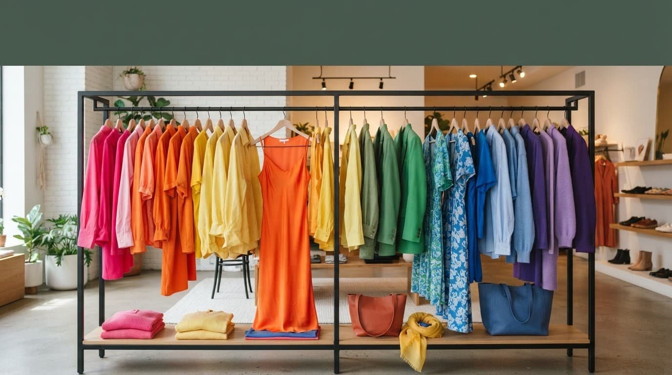
Adjust the proportions for your natural contrast
The 60-30-10 rule, sometimes called the 3 color principle, is flexible because people have different levels of visual contrast. Contrast means the difference in lightness between your hair, skin, eyes, and clothing.
People with lower value contrast often prefer colors close in depth. Soft olive with muted rose, or powder blue with dove gray, can look cohesive. A small accessory in a bright accent color adds life without interrupting the gentle effect.
If your hair and features create stronger contrast, clear pairings may feel more natural. Choosing a dominant color close to your natural depth can keep clothing from overwhelming your face. Black and white, navy and cream, or emerald and pale pink can hold their own, as can red shoes with a bright blue dress.
A quick photo test helps. Take a mirror picture, turn it black and white, and check whether the outfit overwhelms your face. If the clothing looks louder than you do, switch one large color block for a shade closer to your natural depth.
You can also break the 3 color principle on purpose. An 80-20 outfit, such as a navy monochrome base with a bright pink sweater, looks clean and modern. It works well when you want one clear color contrast.
The playful “110%” version uses two accents. Keep a 60 percent dominant shade and a 30 percent secondary shade, then add two separate 10 percent accents. Navy tailoring, a blush blouse, red shoes, and a turquoise bag can work if the accessories stay small and the rest of the look stays simple.
Make printed pieces, metals, and accessories work together
Printed pieces can confuse the 3 color principle because one garment may contain several shades. Instead of counting every tiny flower or stripe, focus on the colors visible from a few steps away.
A cream-and-navy striped sweater usually reads as two colors. A floral blouse with a pale background, green leaves, and tiny red flowers may read mostly as cream and green, with red as a small detail.
Let a print’s background connect to one larger piece, making it the dominant color. Pair a navy-and-orange print with navy trousers; repeat orange in a bag, shoe detail, or hair band for color harmony.
The sandwich method can also improve color coordination. It repeats a shade at the top and bottom of the outfit, framing the middle.
A yellow blouse and yellow flats around blue jeans create a longer, more connected silhouette. You do not need an exact match. The sandwich method works with butter yellow and mustard, since the relationship matters more than identical dye lots.
Repeating gold in hoops, a belt buckle, and warm-toned bag hardware creates intentional metal coordination with camel, orange, red, and olive. Silver jewelry often pairs easily with cobalt, teal, violet, gray, and black.
Mixed metals can look intentional when each metal appears at least twice. They should still fit the 3 color principle. If your accessories are already the 10 percent accent, keep the finish simple so the outfit doesn’t become visually crowded.
Build a colorful capsule wardrobe around the rule
A colorful capsule wardrobe does not need to be neutral. It needs pieces that work together in more than one outfit. Use the 3 color principle to organize dependable foundations and interchangeable accents.
Choose one reliable dominant color for your foundations. Navy, dark green, chocolate, denim blue, or black are practical choices for trousers, skirts, jackets, and coats. Then add two secondary shades that work with that base.
For example, navy clothing pairs easily with off-white, pink, sky blue, red, or chartreuse. A navy blazer, dark denim, and wide-leg navy trousers can support a quiet luxury look as well as brighter outfits without feeling repetitive.
Keep your brightest shades in easy-to-change pieces. A colorful blouse, cardigan, bag, shoe, scarf, or pair of earrings can shift the mood of familiar basics. If you like, use the sandwich method to repeat one accent in two accessories around a central base, creating a flexible capsule wardrobe. This approach makes dressing with confidence easier because you already know the colors belong together.
Before another purchase, use the 3 color principle to see whether statement pieces can fill multiple roles, making wardrobe building easier. Check whether each item can fill a foundation, secondary, or accent role with what you own. That pause helps you choose clothes you will wear often.
Frequently Asked Questions
What is the 60-30-10 color rule for outfits?
The rule divides an outfit into a dominant color covering about 60 percent, a secondary color covering about 30 percent, and an accent color covering about 10 percent. The proportions are visual guidelines rather than strict measurements.
Do neutral colors count in the 60-30-10 rule?
Yes, neutral colors such as black, white, cream, navy, gray, camel, and chocolate can serve as the dominant or secondary color. They create a polished foundation and help bright accents feel cohesive.
How do I choose colors that work together?
Use the color wheel to try analogous combinations, such as teal and cobalt, or complementary combinations, such as blue and orange. Personal preference matters most, so choose shades that make you feel comfortable and confident.
How should I handle prints and patterned clothing?
Focus on the colors that are most visible from a distance instead of counting every tiny detail in the print. Let the print’s background connect to a larger piece, then repeat a smaller shade in an accessory for color harmony.
Can I break the 60-30-10 color rule?
Absolutely. An 80-20 outfit or a look with two small accents can still appear balanced when the color blocks remain clear, and the rest of the outfit stays simple. The rule is a styling framework, not a requirement.
The 3 color principle: A Brighter Way to Get Dressed
The 3 color principle offers a flexible fashion styling framework, but it doesn’t take away your personality. Use it when you want a reliable outfit, then bend it when a print, favorite dress, or joyful accessory asks for more.
A clear color structure can make everyday clothing feel considered. Color psychology can influence mood, but joy and personal taste should have the final say in your Colorful style.