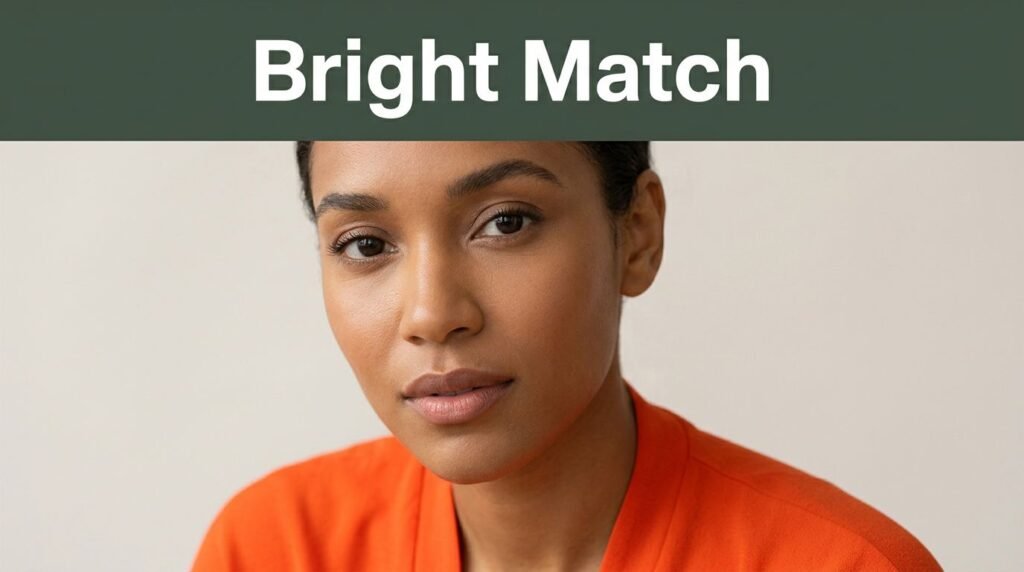
Some bright shades make your skin look fresh, while others make you look worn out in seconds. The difference usually isn’t your courage; it’s your undertone.
If bright clothing has ever felt “too loud” on you, the color may be off, not the idea of color itself. Once you match bright colors to your undertone, colorful attire starts to look easier, cleaner, and much more like you.
Why undertone matters more than skin depth
Skin depth and undertone are not the same thing. Your skin depth is how light or deep your skin looks on the surface. Your undertone is the subtle cast beneath your skin, and it usually reads as warm, cool, or neutral.
That’s why two people with similar skin can look totally different in the same bright top. One may glow in orange-red, while the other looks better in cherry red. The surface depth looks close, but the undertones pull the color in different directions.
Bright colors make this easier to spot because they push contrast. Soft beige can hide a mismatch for a while. Electric pink, saturated yellow, or clear turquoise won’t hide much at all. They either bring your face to life or pull attention away from it.
This matters if you love bright clothes, and it matters even more if you avoid them. A bad color match can make you think you’re “not a color person.” Most of the time, that’s not true. You may only be wearing shades that fight your skin instead of working with it.
Once you know your undertone, shopping gets simpler. You stop buying bold pieces that sit untouched in the closet. You also gain a clearer sense of what kind of colorful clothing feels natural on you.
How to figure out your undertone at home
You don’t need a full color analysis to get useful clues. Good daylight, a mirror, and a few fabric or clothing options can tell you a lot. The goal is to watch what happens to your skin when a color sits near your face.
Start in natural light with no heavy makeup. Hold a warm, bright color, like coral or marigold, near your face. Then try a cool bright color, like cobalt or magenta. If one makes your skin look smoother and your eyes clearer, pay attention to it.
A few common tests can help, although none work alone every time. Veins that appear greener may indicate warmth. Veins that look blue or purple may feel cool. Gold jewelry often flatters warm undertones, while silver often suits cool undertones. If both look good, you may be neutral.
White fabric can give another clue. Stark white often flatters cool undertones. Creamy white often looks better on warm undertones. Neutral undertones can usually wear both, with a slight preference depending on the person.
If a bright shade makes your skin look even and alert, it’s doing its job. If it brings out shadows, redness, or sallowness, move on.
The most helpful test is still your own face. Don’t judge the color on the hanger. Judge what it does to your skin when you wear it.
Bright colors that suit warm undertones
Warm undertones usually have yellow, golden, peach, or olive hints in the skin. Because of that, bright shades with a warm base tend to look more natural and lively.
Good starting points include coral, tomato red, marigold, warm turquoise, and grass green. These colors usually echo the warmth in the skin instead of fighting it. Bright peach and poppy orange can also work well, especially in summer attire.
Warm undertones often look strong when paired with an off-white and one saturated color. A cream blazer over a bright coral top can look cleaner than a stark white blazer with the same top. The color story feels more connected, so the face stays the focus.
Some cool brights can feel harsh on warm skin. Blue-based pinks, icy lavender, and certain sharp cobalt shades may pull out gray or yellow tones. That doesn’t mean you can never wear them. It means you may need to shift the version. A warmer violet or teal often solves the problem.
Fabric matters too. A glossy satin chartreuse reads louder than a matte cotton chartreuse. If you’re new to color, start with the same shade in a softer texture. The color still feels bright, but the overall look of the clothing reads as easier and more wearable.
Best bright shades for cool and neutral skin
Cool undertones usually have pink, red, or blue hints in the skin. They often shine in crisp, clear brights that carry a blue base. Think cobalt, fuchsia, raspberry, true red, emerald, and icy aqua. These shades can make the skin look sharper and the whites of the eyes look brighter.
Neutral undertones sit in the middle. They can often wear both warm and cool brights, but not always with the same impact. One neutral person may look best in watermelon and teal. Another may look stronger in cobalt and cherry. The trick is to test temperature and saturation at the same time.
This quick guide can save time in the fitting room.
| Undertone | Bright shades that usually flatter | Shades to test with care |
|---|---|---|
| Warm | Coral, marigold, orange-red, warm green, golden yellow | Icy pink, blue-red, cool lilac |
| Cool | Cobalt, magenta, cherry red, emerald, icy aqua | Mustard, tomato red, yellow-orange |
| Neutral | Teal, watermelon, balanced red, bright jade, clear pink | Extreme neons, muddy brights |
Use the table as a starting point, not a strict rule. Neutrals have the most room to play, but the wrong version of a color can still look off. For example, a neutral undertone may handle bright yellow well if it’s clean and clear, yet struggle with dusty yellow, which can make the skin look flat.
When bright colors and undertone line up, the whole outfit settles into place. The color looks intentional, not random.
How to wear bright clothes without feeling overdone
Color choice matters, but placement matters too. If you’re unsure, wear your best bright shade near your face and keep the rest simple. A cobalt blouse with dark jeans feels easier than a full head-to-toe bright look.
You can also use quiet basics to anchor a bold piece. Denim, navy, white, cream, gray, and camel help a bright item look polished. That balance makes colorful attire feel modern instead of chaotic.

Fit plays a big role in dressing with confidence. A color you love can still feel wrong if the cut pulls, sags, or swallows your frame. People often blame the shade when the real problem is the garment’s shape.
When you shop, try this simple order:
- Check the color near your face in daylight if possible.
- Notice whether your skin looks clearer or more tired.
- Look at the fit before judging the color.
- Pair the item with one calm basic and see how the whole outfit feels.
Also, give yourself a minute. Many people reject bright clothes because the change feels new, not because it looks bad. If the undertone works and the fit is right, the first reaction may simply be surprise. That passes quickly.
A strong color doesn’t have to shout. When it suits your skin, it often reads more natural than a “safe” shade that drains you.
Mistakes that make colorful clothing look off
The biggest mistake is forcing the wrong temperature. If your skin comes alive in warm shades, a rack full of icy brights will keep disappointing you. The reverse is just as true.
Another common issue is going too neon too soon. Neon sits at the far edge of brightness, and it can overpower the face. Clear, saturated colors are often easier to wear than fluorescent ones. If you’re hesitant, start there.
Poor lighting causes trouble, too. Store mirrors can make almost any attire look strange. If you’re unsure, step near a window or take a quick photo in daylight. The answer usually becomes obvious.
One more mistake is treating bright color like the whole outfit. It still needs shape, fabric, and balance. Great clothing in the wrong color can fail. But the right color in a good fit can make even simple attire look sharp and well planned.
Conclusion
A bright shade can lift your face or flatten it fast. Most of that comes down to undertone, not whether you’re “the type” who can wear color.
When you match bright colors to your skin’s warmth or coolness, shopping gets easier and getting dressed gets lighter. You stop hiding from color and start choosing it with purpose.
The goal isn’t to wear every bold shade on the rack. It’s to find the few that make your skin look awake, your clothing feel right, and your style feel like your own.
This post may contain affiliate links. If you make a purchase through these links, I may earn a small commission at no extra cost to you.