Red gets attention, but it doesn’t have to be hard to style. The trick is pairing it with colors that either calm it down or give it a clean contrast.
If you’ve ever bought a red sweater, dress, or blazer and then left it hanging, you’re not alone. Red clothing can feel bold, especially if bright clothes aren’t your usual thing. Still, the right pairings make red look polished, modern, and easy to wear.
Once you know which shades soften red and which ones sharpen it, getting dressed takes less guesswork. Start with the red itself, because not every red wants the same company.
Start with the shade of red
The best red outfit colors depend less on rules and more on temperature. A tomato red top and a burgundy coat don’t behave the same way, even though both are red.
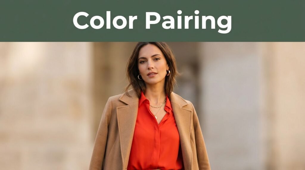
Warm reds have orange or rust in them. They look natural with cream, camel, tan, brown, olive, and gold. Those shades share the same warmth, so the outfit feels easy instead of harsh.
Cool reds lean blue. Cherry red, ruby, and many holiday reds sit in this group. They pair well with white, charcoal, navy, true black, and silver. These combinations look crisp and work well with sharper attire.
Deep reds sit in the middle but feel richer. Burgundy and wine tones pair well with gray, blush, taupe, and dark denim. Because they already look dressed up, they don’t need loud extras. They also work well in thicker fabrics like wool, suede, and knitwear.
This quick guide makes the first match easier.
| Shade of red | Colors that work well | Overall effect |
|---|---|---|
| Cherry red | White, navy, charcoal, silver | Crisp and polished |
| Tomato red | Cream, camel, denim, gold | Warm and casual |
| Brick red | Olive, tan, brown, ivory | Earthy and relaxed |
| Burgundy | Black, gray, blush, taupe | Rich and dressy |
Fabric matters too. A matte brick-red cardigan feels softer than a glossy scarlet skirt. So, if a pairing looks off, the issue may be texture as much as color.
Once you match the undertone, most red outfit colors stop feeling random and start looking planned. That first step matters more than any trend. It also saves you from blaming red when the real issue is a clash between warm and cool shades.
Neutral colors that make red feel easy
If you want the easiest answer, choose a neutral. Red already carries the energy, so the rest of the outfit can settle it.
When red feels tricky, pair one red piece with one calm neutral and keep the rest simple.
White makes red look clean and fresh. A red cardigan with white jeans feels bright, not heavy. Cream does a similar job, but it looks softer and a little richer than stark white. If your red is warm, cream usually beats icy white.
Beige, camel, and tan are strong partners for daytime. They pull heat from warm reds and soften brighter ones. A red blouse with camel trousers looks pulled together without trying too hard. The same goes for a red knit with tan loafers and a beige trench.
Gray is underrated with red. Light gray gives a sporty, modern feel, while charcoal feels smarter and a bit more formal. If your clothing leans minimal, gray helps red look current. It also works well for office attire, because it tones down red without draining it.
Black gives the strongest contrast. It works best when you want shape and edge, such as a red knit with black trousers or a red dress with black boots. Still, black can make bright red feel intense, so break it up with skin, texture, or a lighter bag.
You can also stack neutrals around one red piece. A red sweater, cream pants, tan belt, and brown bag create depth without looking busy. That mix works especially well if bright clothes aren’t your comfort zone.
Simple pairings help with dressing with confidence. When the base is calm, red feels intentional instead of loud.
Colorful pairings that still look balanced
Neutrals aren’t the only answer. If you like a colorful closet, red can play well with other shades as long as one color leads and the other supports. The goal isn’t chaos. The goal is balance.
Navy is one of the safest non-neutral partners. It gives red depth without the stark feel of black. A red blazer over a navy dress or a red sweater with dark blue trousers looks both classic and relaxed. Among the many shades of red, navy is usually the easiest next step after cream and camel.
Denim blue works for the same reason. Mid-wash jeans, a faded chambray shirt, or a structured blue skirt can cool down red and make it feel casual. This is one of the best ways to wear red clothing on ordinary days, because denim keeps the whole look grounded.
Olive and forest green bring out the earthy side of red, especially brick, rust-red, and deep scarlet. These pairings feel rich in fall, but they also work year-round when the fabrics are simple.

Photo by Marina Abrosimova
Blush pink and dusty rose can look surprisingly good with red. The secret is contrast in softness, not equality. Choose one soft pink piece, then keep shoes and bags neutral so the outfit doesn’t turn overly sweet. Red with hot pink can work too, but that pairing asks for more confidence and cleaner lines.
A tonal look also works. Try red with burgundy, oxblood, or berry when you want depth instead of a sharp contrast. Similar tones make colorful dressing feel more refined, especially in wool, satin, or ribbed knits.
One rule keeps these bolder mixes wearable. Stop at two main colors, then let accessories stay quiet. That small limit keeps a colorful outfit from pulling in too many directions.
Shoes, bags, and details that change the mood
Accessories change the mood fast. The same red dress can feel crisp with white sneakers, sharp with black heels, or soft with tan sandals. Small choices matter more than people think.
For shoes, repeat the outfit’s logic. Use white or cream when the look is fresh and light. Pick black for more contrast. Choose tan, cognac, or brown when the red has warmth or when the outfit includes camel, olive, or denim. Brown suede, in particular, makes red feel relaxed.
Bags should support the look, not fight it. Black leather is clean. Tan is easy for the day. Metallic bags work best in small doses in the evening. Gold flatters orange-based reds, while silver suits blue-based reds.
Jewelry follows the same rule. If the red reads warm, gold feels natural. If it looks cool, silver keeps the palette crisp. Pearls can bridge both, especially with red knits, blouses, and simple dresses.
Makeup can either help or clash. If you’re wearing a red top near the face, either match the lip closely or keep it neutral. A slightly wrong red lipstick can stand out more than a wrong shoe. Meanwhile, soft brown eye makeup works with almost every red tone.
Texture matters here, too. Black patent shoes with a red satin dress feel dressed up. Brown suede boots with a red knit dress feel softer and more casual. So even when the color stays the same, the finish can shift the whole outfit.
Don’t try to match every red exactly. A red shoe, red bag, and red top in three different shades of red often look off. One red statement piece usually works better than a full matching set. The rest of your attire can stay simple, and the outfit still feels complete.
Final thoughts
Red isn’t hard to wear; it only asks for balance. Start by reading the shade, then choose either a quiet neutral or one clear contrast color.
If you remember one rule, let red lead. The rest of your clothing should support it, not compete with it. Once that clicks, red stops feeling risky and starts feeling like one of the most useful colors in your closet.
This post may contain affiliate links. If you make a purchase through these links, I may earn a small commission at no extra cost to you.